Flash Apps
-
October 28, 2023
Design a Shopify cart that sells with Flash Cart
How to optimize your store's cart experience as part of your sales strategy.
You can do everything right when it comes to your customer’s journey through your online store but if you haven’t optimized your Cart experience you’re likely missing out on valuable sales. Your cart is like the MVP of your site and plays a key role in converting visitors into customers. Carts typically display a simple summary of the items added, along with their prices and quantities — but what if your cart could be an even more powerful part of your sales strategy?
That’s precisely why we designed Flash Cart
Once a visitor reaches the Cart your goal is to convince them to move from “I’m just taking a look” to “Take my money!”, so we’ve designed our Flash Cart app to reduce cart abandonment by creating a compelling buying experience
Flash Cart gives you the power to extend the functionality of your cart by using a system of drag-and-drop blocks to create a streamlined and easy-to-navigate experience to supercharge your conversions.
The key components of a Cart that converts
Let’s explore the key features built into Flash Cart that will transform your sales:
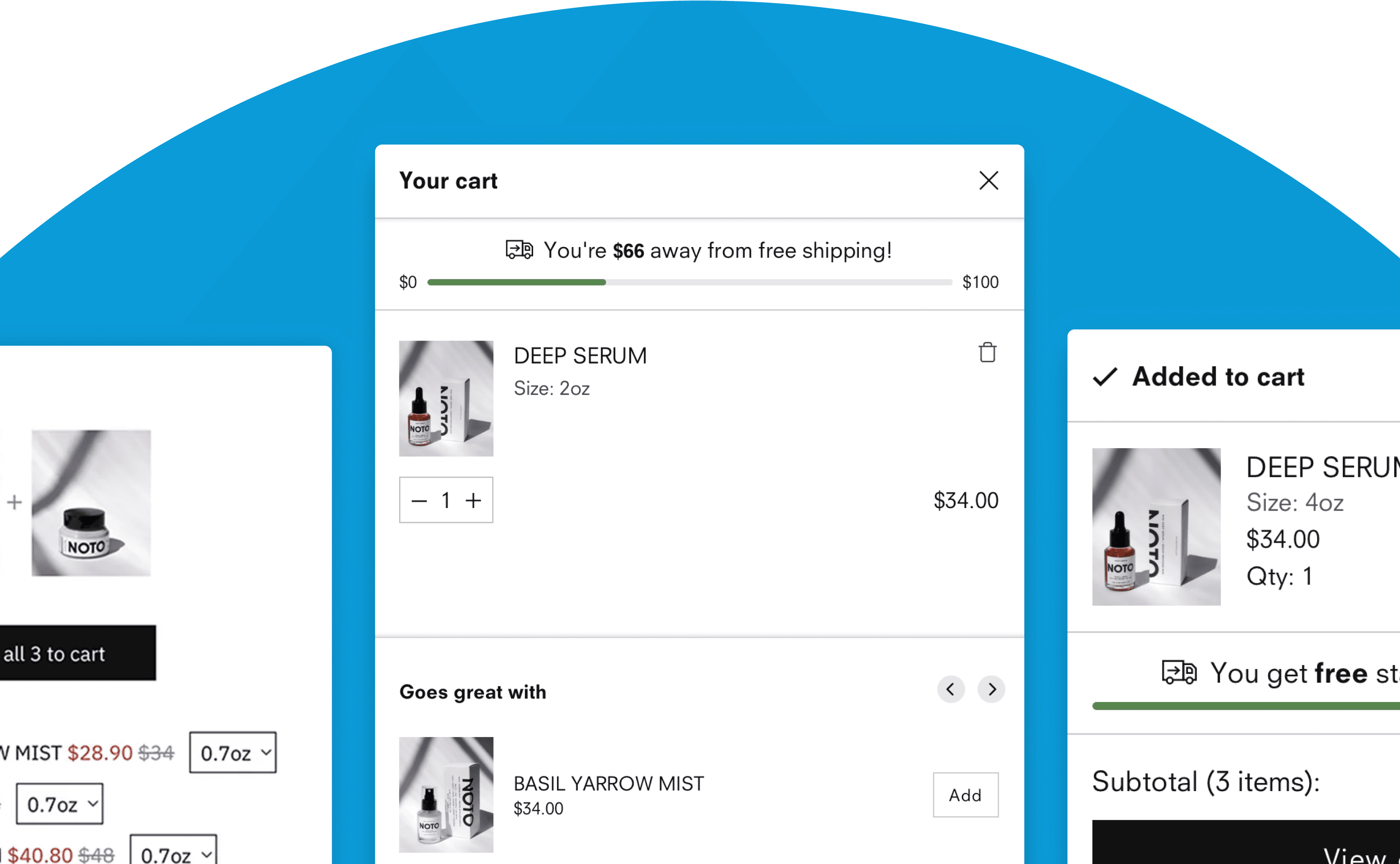
Cross-sell recommendations

Leveraging cross-selling opportunities within the Cart is a powerful way to increase your average order value and boost conversions. By displaying complementary items in a non-intrusive manner, you’re providing additional value that positively influences your customer’s perception of your brand.
It’s always important, however, to make sure your recommendations are relevant. Product suggestions that feel unrelated can quickly erode their confidence, so take a little extra time to curate your hand-picked items or use automatic recommendations that use behavioural data.
Reducing friction points

We’ve included multiple elements in the Flash Cart system that are designed to quickly eliminate confusion and encourage checkouts.
The first is the 'Free shipping countdown bar,' which is an incredibly effective way of motivating customers to purchase more items to unlock savings. Given that nearly half of online shoppers who abandon a purchase do so due to unexpected costs like shipping, this is a must-have feature!
We also recommend enabling the 'Low inventory warning' to create scarcity and encourage visitors to complete their purchase before lower stock items sell out.
Trust building elements
Another common reason for cart abandonment relates to uncertainty about the security of your online store. Including a 'Payment icon' block in your cart design helps build credibility and trust in your brand.
You can also use the 'Text list with icons' block to feature things like free returns and customer service standards, and ensure potential customers are aware of your brand's values.
Setting both of these features up is made super easy by Flash Cart’s app block functionality. Simply select the feature and drag and drop it into the position you’d like for it to appear on your cart.
Consistent branding
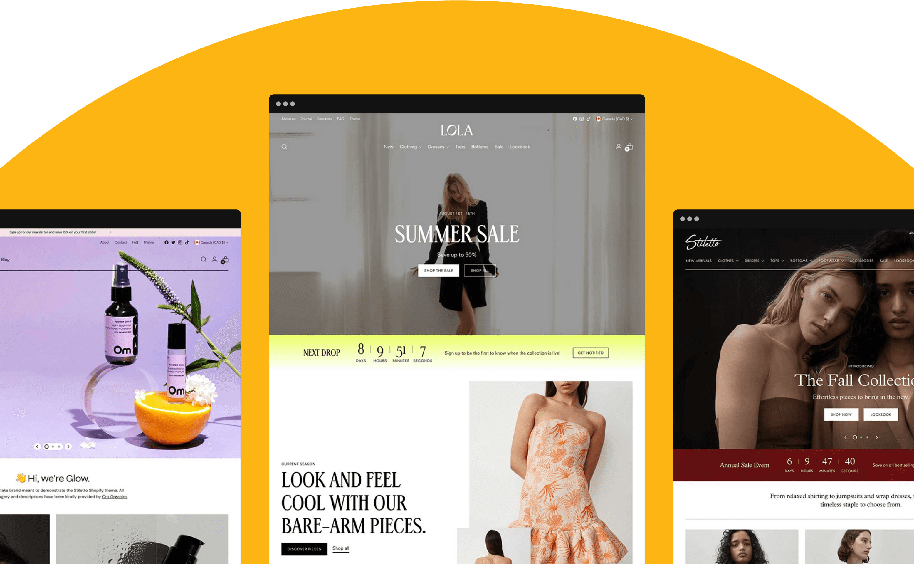
The cart is an extension of your brand’s experience and should feel like it flows with the rest of your site. The design and messaging within your cart should align closely with your overall website’s aesthetic and branding elements, such as logos, colours, and typography. Flash Cart makes that possible by matching your theme’s style, as well as allowing for in-depth appearance customization.
This visual coherence demonstrates to your customers that you care about their relationship with your brand and reinforces your brand identity. Having a seamless website-to-checkout flow reassures them that they are on the right track and eliminates any doubts they might have.
Add-to-cart notifications

Beyond a well-designed cart, it's important to provide a clear path for customers to review their cart and proceed to the checkout for a great user experience.
Flash Cart includes three different popup notification options to reassure customers that they've added the product they want and present clear next steps to either add more items to their cart or continue to the checkout, rather than resume browsing or delay buying your products.
Put this to work today in your Shopify store.
Optimizing your e-commerce cart and checkout experience is crucial for driving conversions and increasing customer satisfaction. By understanding the importance of e-commerce carts, leveraging Shopify apps to enhance your storefront, and implementing best practices (such as branding coherence, add-to-cart notifications, and effective cross-selling techniques), you can create a seamless and compelling shopping experience for your customers.
The Ecosystem
Fluorescent ecosystem
Learn how Fluorescent’s team helps you boost conversion with themes, apps and award-winning support team.
Our apps
Discover Fluorescent apps
Enhance your online store's performance with features to streamline your sales process, engage your target audience, and boost your sales.
Our themes
Discover Fluorescent themes
Pair any of our apps with our responsive, feature rich, and highly customizable Shopify themes built for boosting sales.


