Hello and welcome to the first ever Fluorescent blog post. I’m your host, Liam Sarsfield, Founder of Fluorescent. My hope is that I can write one of these every few months, whenever we push major updates, to give our merchants a better understanding of what we’re working on and why.
For the last few years, we’ve pushed out regular updates to our themes almost every two weeks. This was consistent with a philosophy of “ship early, ship often.” It meant that we weren’t getting in our heads about major feature releases. If something provided value, we sent it out into the world. This is the healthiest way to build software.
Recently, we were instructed by Shopify to compress our updates into monthly releases. While merchants used to complain that we were shipping new versions too often, now they’re complaining that we’re shipping too infrequently. Fear not: behind the scenes, everything is much the same.
April’s releases are huge. And we’re really proud of them. Full release notes are attached below, but let’s talk through them.
We’ve changed our lightboxes
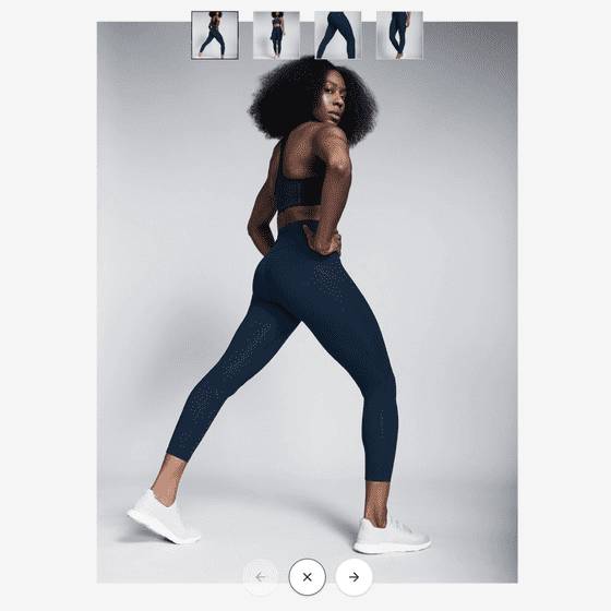
We’ve made a small change to the lightboxes on all of our product pages. When clicking on a product image, the lightbox will display that product image fully zoomed out. Customers will need to click again to zoom in. It’s a small change, but one that merchants were particularly vocal about.
Lorenza gets a major refresh
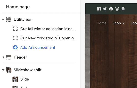
This month, our premier fashion-oriented theme got a complete refresh. We’ve redesigned the header of Lorenza and the end result is something far more versatile than what we had before. The announcement bar has become a “utility bar” which has the option for social media icons, currency and language selectors. Note that we’ve had to remove the option to set custom colours for each announcement. But you can still give the utility bar a solid colour if that's what you want — if you don’t, it’ll just show up as if it’s part of the navigation bar with a slightly clipped horizontal rule to separate them.
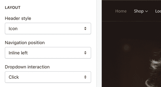
The initial re-release of Lorenza contained a number of header layouts. Few of them were very useful or things that we saw people using in the wild. The new header contains a variety of new layouts that you will absolutely use. You can explore these by playing around with the “navigation position” setting in the Header section in your theme settings.
The new “header style” setting allows you to use icons for account, cart and search links. This is a small change, but one that’s been lighting up our customer feedback boards for months. Initial visual research of merchants in this segment suggested to me that icons weren’t something that folks wanted, but alas I was wrong. The new icons we’ve introduced are custom made and were commissioned from the same designer who did the Fluorescent logo. They’re some of the most beautiful icons that I’ve seen in a theme, and you can control their weight, so if they’re too light and airy for you, you can adjust them in your theme settings. I hope you like them as much as I do.

I’ve also spent quite a bit of time rethinking the typographic hierarchy of the product page. Previously, the hierarchy of this page was almost entirely flat. That meant that the difference between a heading, a subheading and a block of text was almost non-existent. I was using a secondary text colour (and space) to create hierarchy. While the end result was a super airy and minimal aesthetic, it came at the expense of readability. I’ve fixed this up by changing out the font used for variant labels (from body text to heading text). There’s a risk that your heading text won’t look good at a smaller size, but I think we needed to get a little bold to solve this problem, and I’m interested to see how people respond to it.
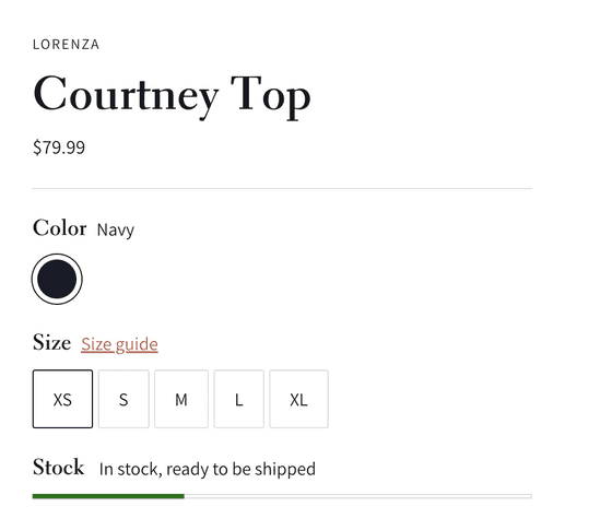
The product page update comes with a variety of other new features. Most notably, you can now change the size of your product images. If you want them small, you can do that. I don’t know how many times folks have emailed us about their product images being too big, but my hope is that this manual control solves that issue. You can also now add editorial content directly to your product form. This comes in the form of two new content blocks. We’ve also introduced a shipping estimator block, a security block and a payment widget block, and we’ve introduced the ability to position these in the left-hand column, beneath the product images.
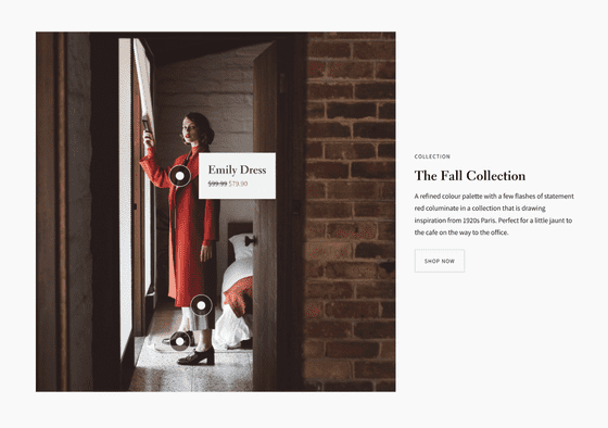
Two new sections have made their way into the theme this month and that’s the shoppable image and the shoppable feature. They’re two different versions of what is essentially the same thing: a way of tagging an image with a product and having those products indicated with “nodes.” These are universally desired sections that have done well in our other themes, and would seem particularly useful in the context of a lookbook. Play around with them and let us know what you think.
You’ll notice that the theme has a lot more sections. This is because we’ve “disaggregated” a lot of our previous sections. Our sections simply did too much before and few merchants were aware of the full extent of how our sections could be customized. We’ve subsequently broken up Sections that were too complicated into simpler, more intuitive Sections. This change came as a result of a merchant interview that we did in which a merchant asked why we did not offer “Image hero” sections. I responded that an image hero was accomplished with a slideshow with one slide. It then occurred to me how completely unobvious that was! Well, “Image heros” are now in the theme.
Finally, we've introduced javascript custom events so developers can easily add their own functionality to the theme without needing to edit the theme's javascript files. We’ll be writing up a quick guide on how to use those in our documentation in the next few weeks.
Ira gets new mega navigation blocks and new mosaic grids
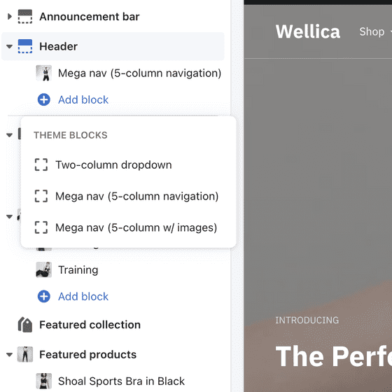
We’ve introduced two new mega navigation block types to Ira — both assume that you have a large number of product collections. One block is a fairly standard five-column popover with a feature image on the right, and the other is a less common five-column popover where each column gets its own feature image.
We’ve also ported our much-loved mosaic grids to Ira. These allow you to get creative with grid squares of varying sizes and shapes. There are two types to play around with: a three column version (where grid items are reducible to 1/3rds), and a two column version (where grid items are reducible to 1/2s).
In addition to a number of other fixes, we've also introduced javascript custom events to Ira so that developers can easily add their own functionality to the theme without needing to edit the theme's javascript files. More on that soon.
Spark gets some love
There are no new features for Spark this month. However, a number of small fixes and changes were published. Take a cruise through the change log below. We’ll be looping back to Spark in a few weeks to start tackling features requested in our customer feedback boards (so if you haven’t requested anything recently, get to it!). The biggest thing that we’ve been working on for Spark behind the scenes is animation. We shipped Spark with only a few select animations, but we've always wanted to go back and expand on them. Well, we’ve done it, and it all looks amazing. Just needs a bit of polish. Stay tuned.
We’re working on something new
Fluorescent has grown rather dramatically over the last year or two, which has allowed us to find time to work on a new theme. That theme is, frankly speaking, the best thing we’ve ever made, and it’s probably 4-6 weeks away from release. If you’re interested, sign up for our newsletter below.
We’re looking for partners
We’re also growing our partners program. If you’re a Shopify developer, agency or app partner, head over to the partners page and register for our partners program. Partners get a cut of theme sales and we'll be sending some work their way.
That’s it for this month. If you want to stay in touch about future updates, subscribe below. We’re working on refreshing our newsletter and getting better at communicating with you, and blogs like this are where it starts.
April Changelogs
Lorenza 5.0.0 is our first major post-OS2 release. It contains an entirely new header with entirely new layouts (including the much requested ability to use icons instead of text for cart, login etc.), a much improved product page (with additional blocks for things like payment icons, shipping estimators and editorial content), new "shoppable image" sections, as well as many additional fixes to make your life with Lorenza easier. Note that we've broken up a number of sections to make the theme less complicated (so that you can find what you need faster). Thank you to all of the merchants who have used our customer feedback boards to share their insights with us.### Added- Added two new sections: "Shoppable image" and "Shoppable feature" - now you can tag images with products and have them revealed on hover- Added a new mosaic grid section - far most flexible and better for creating lookbooks- Added new "Image hero" and "Video hero" sections- Added "Featured collection row" section- Added Tiktok and LinkedIn icons to social list- Added additional settings for customizing buttons- Added block specific max-widths to: Image with text, Newsletter, Richtext sections- Added more header layout options via "Navigation position" and "Navigation alignment" settings- Added an option to display icons for account, search and cart in the header. Shout out to our icon designer, these are gorgeous!- Added social icons, currency and language to the announcement bar (which is now called the utility bar!)- Added additional font style controls to the header (weight, size, capitalization, letter spacing) - we've been calling this the "header style booster pack" and it's yours free of charge- Added the ability to specify whether you'd like menus to open via hover or click within the header- Added manual subheading and heading size controls to the following sections: slideshow, slideshow split, image hero, video hero- Added a swatch label that clearly indicates which swatch is selected - sorry that wasn't there to begin with- Added ability to control the width of product images on the product page on desktop - we beg you not to email us about your product images being too big- Added product page thumbnail aspect ratio controls- Added the "text with image feature" block type to the product form - introduce editorial content right into the form- Added the "text with video feature" block type to the product form - just like the above, but video- Added shipping estimator block type to product form (called a "Shipping widget")- Added payment icons block type to product form (called a "Payment widget")- Added security block type to product form (called a "Security widget")- Added the ability to align blocks in the left and right columns of the product page (only certain blocks)- Added the ability to change the size of the title and price on the product page and within the featured product section- Exposed custom javascript events for merchants and their developers### Removed- Collage section has been replaced with the mosaic grid- Announcement bar has been replaced with the utility bar### Changed- Alphabetized sections within theme editor- Removed initial fade in on announcement bar- Slideshow section has been broken out into three separate section: slideshow, image hero, video hero sections- Featured collection has been broken into two separate sections: featured collection and featured collection row- Changed typographic style of product form on the product page (labels now use header instead of body)- Updated accordion style - now its clearer that they're accordions### Fixes and improvements- Improved quick add notification behaviour- Improved product page quantity selector hover behaviour- Improved product page share button hover behaviour- Improved how the product lightbox handles images overflowing the container- Improved sticky product form behaviour on the product page- Updated surface pickup translation string to offer more versatility to merchants- Updated surface pickup translation string to offer more versatility to merchants- Fixed issue with focal point setting within Slideshow sections- Fixed policy page header not being sized correctly- Fixed content-max-width not applying properly on pages- Fixed issue where sections were not scrolling properly when selected within the customizer on the collection template- Fixed issue where Slideshow sections were flickering on load- Fixed issue with product cards using the same aspect ratio as other sections with the same product- Fixed recommended products not using dynamic settings- Fixed filter breaking when items have apostrophe/single quote ' or double quote "- Fixed product chips/swatches breaking when variant option name has double quotes ".- Fixed spacing around article comment pagination- Fixed issue with slideshow text position top/bottom padding on mobile when header is transparent- Fixed drawer menu account link to say Logged in instead of Logout
Ira v4.1.0 contains many community-requested improvements and bug fixes. We've brought 2 new Mosaic grid sections to the theme, refined our product lightbox, and released two new mega navigation blocks.### Added- Added two new mega navigation blocks- Added 2 Column Mosaic Grid section- Added 3 Column Mosaic Grid section- Added swatch color text values next to labels- Added "Remove" link to items in the quick cart- Added Aspect Ration controls to "Testimonials" section- Exposed javascript events for developers working with Ira (see our docs or send us a message)### Changed- Changed the product lightbox to contain images within the viewport- Updated surface pickup translation string to offer more versatility to merchants### Removed- Collage section (replaced with two mosaic grids)### Fixes and improvements- Improved slideshow performance if the first slide is a video- Improved image performance with Featured product section and the Popup section- Fixed in your space model viewer not working properly.- Fixed country selector not scrolling in the drawer menu properly on mobile- Fixed overlap issue with transparent header and collection intro- Fixed gifs not playing properly when used as images- Fixed alignment of dynamic checkout buttons on the cart page- Fixed video-pause buttons showing before a user had moved their mouse- Fixed product chips/swatches breaking when variant option name has double quotes "- Fixed filter items with apostrophe/single quote ' or double quote " not working.- Fixed translation string- Fixed drawer menu account link to say Logged in instead of Account- Fixed store availability translation strings being switched between German and Spanish
Context v2.0.3 brings general bug fixes and a few heavily requested improvements. Product lightbox image sizing has been adjusted and swatch values now display as text next to their labels. We've also added a containerless option to Image with text.### Changed- Add a swatch value as text beside the label that updates on variant change- Update how the product lightbox handles large images to contain. Images will no longer overflow- Update surface pickup translation string to offer more versatility to merchants- Change Image with text settings to align with Mosaic grid and allow for a containerless option### Fixes and improvements- Fix the spacing of the top of the header once it becomes sticky- Fix Slideshow section with transparent header breaking when no announcement bar blocks- Fix filter items with apostrophe/single quote ' or double quote " not working- Fix product chips/swatches breaking when variant option name has double quotes- Fix store availability translation strings being switched between German and Spanish- Fix alignment of dynamic checkout buttons on the cart page- Fix Change drawer menu account link to say Logged in instead of Account
Spark v2.5.4 brings many quality of life improvements to the theme. Including fixes to our Product template lightbox, and displaying swatch values as text beside the label.### Changed- Update how the product lightbox handles large images to contain. Images will no longer overflow- Added a swatch value as text beside the label that updates on variant change- Update surface pickup translation string to offer more versatility to merchants### Fixes and improvements- Fix Product template lightbox images overflowing the viewport- Fix Product template chips/swatches breaking when variant option name has double quotes- Fix Change drawer menu account link to say Logged in instead of Account- Fix Announcement bar being too wide when only one announcement- Fix Slideshow section not showing on password page- Fix Image with text section text alignment setting not being represented at mobile sizes- Fix Product template left column blocks not hiding properly on at mobile sizes- Fix alignment of dynamic checkout buttons on the cart page